Dealer Portal Analytics
The Dealer Portal Analytics dashboard provides a comprehensive view of dealer portal performance, user behavior, and operational effectiveness. It brings together analytics across the key stages of the dealer experience, from shopper and lead progression to deal outcomes, user engagement, customer outreach, workflow efficiency, and feature adoption. This gives stakeholders a centralized view of how the portal is being used and how effectively it supports dealer operations.
The dashboard helps users identify performance trends, conversion opportunities, engagement patterns, communication effectiveness, workflow bottlenecks, and feature adoption. By combining high-level KPIs with trends, rankings, and detailed user-level drilldowns, Dealer Portal Analytics turns portal activity into actionable insight for improving both the dealer user experience and overall business performance.
Outcome Effectiveness
The Outcome Effectiveness tab provides insights into how effectively dealer portal users progress through key stages of the shopper journey. It focuses on shopper-to-authentication conversion and agent performance, helping users understand both overall outcome rates and the contribution of individual dealer portal agents.
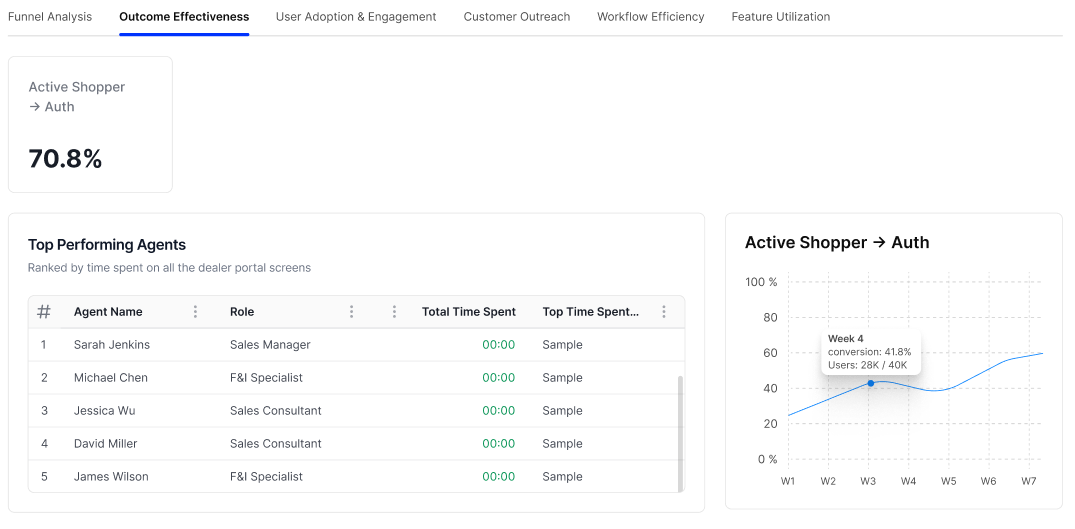
Active Shopper Auth
Displays the percentage of active shoppers who progress to authentication.
The KPI card provides:
- Conversion Rate - Displays the overall percentage of active shoppers who reach the authentication stage.
- Active Shopper Auth - Identifies the specific journey transition being measured.
This metric provides a high-level view of how effectively active shoppers are progressing toward authentication.
Top Performing Agents
Displays a ranked list of dealer portal agents based on the time they spend across dealer portal screens.
The table includes:
- Rank - Displays the agent’s position in the ranking.
- Agent Name - Identifies the dealer portal agent.
- Role - Displays the agent’s assigned role.
- Total Time Spent - Shows the total time the agent has spent on dealer portal screens.
- Top Time Spent - Displays the relevant top time-spent information associated with the agent.
The table can be scrolled to view additional agents and provides a comparative view of agent engagement with the Dealer Portal.
Active Shopper Auth Trend
Displays the Active Shopper → Auth conversion rate over time.
The line chart includes:
- Weekly Trend - Shows conversion performance across weekly intervals.
- Conversion Percentage - Represents the percentage of active shoppers progressing to authentication.
- User Volume - Displays the number of users contributing to the conversion calculation when viewing individual data points.
Hovering over a data point provides additional details for that week, including the conversion rate and user count.
This visualization helps users identify changes and trends in authentication conversion effectiveness over time.
User Adoption & Engagement
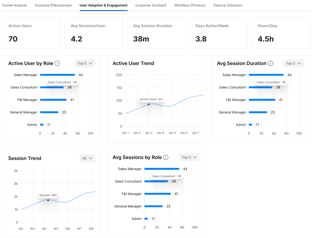
The User Adoption & Engagement tab provides insights into how frequently dealer users access and interact with the portal. It measures user activity, session behavior, usage frequency, and engagement across different user roles.
Active Users
Displays the total number of active dealer users within the selected reporting period.
The KPI provides a high-level view of the number of users actively engaging with the Dealer Portal.
Avg. Sessions/User
Displays the average number of sessions initiated per active user.
This metric helps indicate how frequently users return to and interact with the Dealer Portal during the reporting period.
Avg. Session Duration
Displays the average amount of time users spend in a portal session.
This KPI provides an indication of the depth of user engagement, with longer session durations generally indicating more time spent interacting with portal functionality.
Days Active/Week
Displays the average number of days per week that users are active on the Dealer Portal.
This metric helps measure the consistency and frequency of portal usage.
Hours/Day
Displays the average number of hours users spend on the Dealer Portal per active day.
This provides an additional measure of daily user engagement.
Active User by Role
Displays the number of active users grouped by their dealer portal role.
Users can use the Top 5 filter to control the number of roles displayed.
The chart provides a comparison across roles such as:
- Sales Manager
- Sales Consultant
- F&I Manager
- General Manager
- Admin
The horizontal bars represent the number of active users associated with each role.
Active User Trend
Displays the number of active users over time.
The line chart shows:
- Time-based activity across the selected period.
- Active user count for each reporting interval.
- Trend direction to help identify increases or decreases in user adoption.
Hovering over a data point provides the active user count for that period.
Avg. Session Duration by Role
Displays the average session duration associated with each dealer user role.
Users can use the Top 5 filter to control the number of roles displayed.
The chart allows users to compare session duration across roles and identify which user groups spend more or less time within the Dealer Portal.
Session Trend
Displays the overall number of portal sessions over time.
The chart includes an All filter that allows users to adjust the displayed data scope.
The trend visualization helps identify changes in portal usage and periods of increased or decreased session activity.
Hovering over a data point provides the session count for the corresponding period.
Avg. Sessions by Role
Displays the average number of sessions associated with each dealer user role.
Users can use the Top 5 filter to control the number of roles displayed.
The chart provides a role-by-role comparison of session frequency, helping identify which user groups interact with the portal most frequently.
Dealer User Drill Down
Provides detailed user-level information for analyzing individual dealer user engagement.
The table includes:
- User - Identifies the dealer user.
- Role - Displays the user’s assigned role.
- Avg. Session Duration - Shows the user’s average session duration.
- Avg. Sessions - Displays the user’s average number of sessions.
- Hours/Day - Shows the average daily time spent in the portal.
- Days/Week - Displays the average number of active days per week.
- Deals Created - Shows the number of deals created by the user.
The table can be scrolled to view additional dealer users and provides a more granular view of individual user adoption and engagement.
Customer Outreach
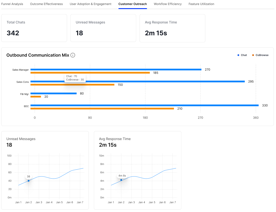
The Customer Outreach tab provides insights into customer communication activity through chat and co-browsing. It helps users monitor communication volume, unread messages, response times, outreach activity, and individual user performance.
Total Chats
Displays the total number of customer chat conversations during the selected reporting period.
This KPI provides a high-level view of customer communication activity through the chat channel.
Unread Messages
Displays the total number of unread customer messages.
This metric helps users identify the volume of customer communications that may require attention or a response.
Avg. Response Time
Displays the average time taken to respond to customer messages.
This KPI provides an indication of how quickly customer inquiries are being addressed. A lower response time generally indicates faster customer engagement.
Outbound Communication Mix
Displays outbound customer communication activity across different dealer user roles.
The chart compares two communication methods:
- Chat - Customer communication conducted through chat.
- CoBrowse - Customer interactions supported through co-browsing.
The horizontal bars allow users to compare the volume of each communication method across roles such as:
- Sales Manager
- Sales Consultant
- F&I Manager
- BDC
This visualization helps identify which roles generate the most outbound customer communication and which communication channels they use.
Unread Messages Trend
Displays the number of unread messages over time.
The line chart provides:
- Time-based trend - Shows changes in unread message volume across the reporting period.
- Unread message count - Represents the number of unread messages for each period.
- Data Point Details - Hovering over a point provides the corresponding unread message count.
This trend helps users identify periods where unread customer communications increase or decrease.
Avg. Response Time Trend
Displays changes in the average customer response time over time.
The chart includes:
- Time-based trend - Shows response-time changes across the reporting period.
- Response Time - Represents the average time taken to respond to customer communications.
- Data Point Details - Hovering over a point provides the average response time for that period.
This allows users to monitor whether customer response performance is improving or slowing over time.
Outreach Performance
Provides a user-level breakdown of customer outreach activity and performance.
The table includes:
- User - Identifies the dealer portal user.
- Role - Displays the user’s assigned role.
- Avg. Response Time - Shows the user’s average response time to customer communications.
- Active Chats - Displays the number of active customer chats associated with the user.
- Unread Messages - Shows the number of unread messages associated with the user.
- Outreach Messages - Displays the number of outreach messages sent by the user.
- CoBrowsing - Shows the user’s co-browsing activity.
The table can be scrolled to view additional users and provides a detailed view of individual customer outreach performance.
Workflow Efficiency
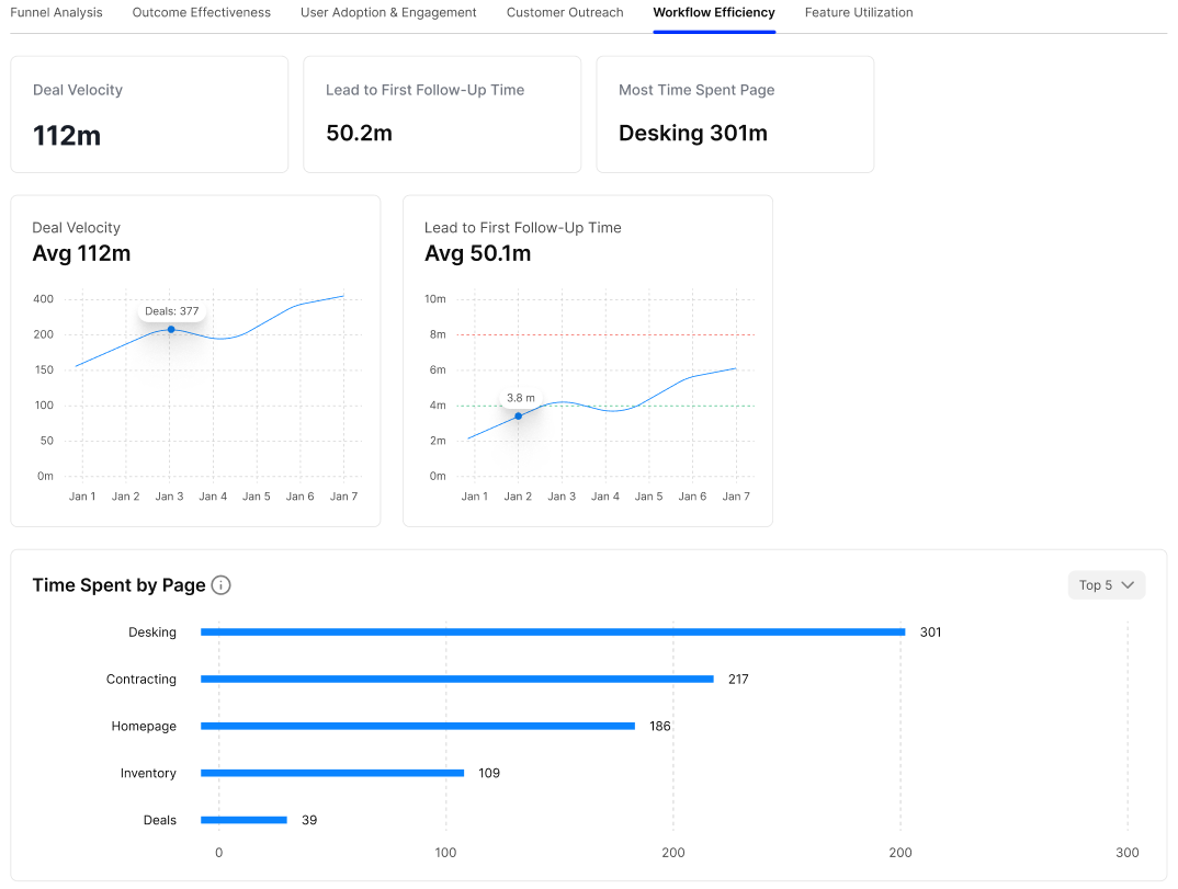
The Workflow Efficiency tab provides insights into how efficiently users move through key dealer portal workflows. It focuses on deal velocity, lead follow-up time, page usage, and user-level workflow performance.
Deal Velocity
Displays the overall time taken to progress deals through the workflow.
The KPI provides the current deal velocity value, giving users a high-level view of how quickly deals are moving through the Dealer Portal.
Lead to First Follow-Up Time
Displays the time taken from lead creation to the first follow-up activity.
This KPI helps users measure how quickly leads receive their initial follow-up and provides an indication of responsiveness within the sales workflow.
Most Time Spent Page
Identifies the Dealer Portal page where users spend the most time.
The KPI displays the page name along with the corresponding amount of time spent, allowing users to quickly identify the most time-intensive area of the portal.
Deal Velocity Trend
Displays the average deal velocity over time.
The line chart provides:
- Average Deal Velocity - Shows the current average time associated with deal progression.
- Time-Based Trend - Illustrates changes in deal velocity across the reporting period.
- Deal Volume - Hovering over a data point can display the number of deals associated with that period.
This visualization helps users identify changes in workflow speed and deal-processing efficiency.
Lead to First Follow-Up Time Trend
Displays the average time taken to perform the first follow-up after a lead is created over time.
The chart includes:
- Average Follow-Up Time - Shows the current average.
- Time-Based Trend - Tracks changes in follow-up time across the reporting period.
- Reference Indicators - The chart includes visual reference lines to help compare performance against defined time thresholds.
This allows users to monitor whether lead follow-up is becoming faster or slower over time.
Time Spent by Page
Displays the amount of time users spend on different Dealer Portal pages.
Users can use the Top 5 filter to control the number of pages displayed.
The chart ranks pages based on time spent, with examples including:
- Desking
- Contracting
- Homepage
- Inventory
- Deals
The horizontal bars provide a comparison of page usage and help identify areas of the portal that consume the most user time.
User Workflow Efficiency Summary
Provides a user-level breakdown of workflow efficiency metrics.
The table includes:
- User - Identifies the dealer portal user.
- Role - Displays the user’s assigned role.
- Lead to First Follow-Up Time - Shows the user’s average time from lead creation to the first follow-up.
- Deal Velocity - Displays the user’s average deal progression time.
- Total Deals - Shows the total number of deals associated with the user.
The table provides a detailed view of individual workflow performance and allows users to compare efficiency across dealer portal users and roles.
Feature Utilization
The Feature Utilization tab of the Dealer Portal Analytics Dashboard provides insights into how frequently Dealer Portal features are used and how users interact with those features. It highlights the most and least utilized features, tracks feature interactions over time, and provides detailed user-level utilization data.
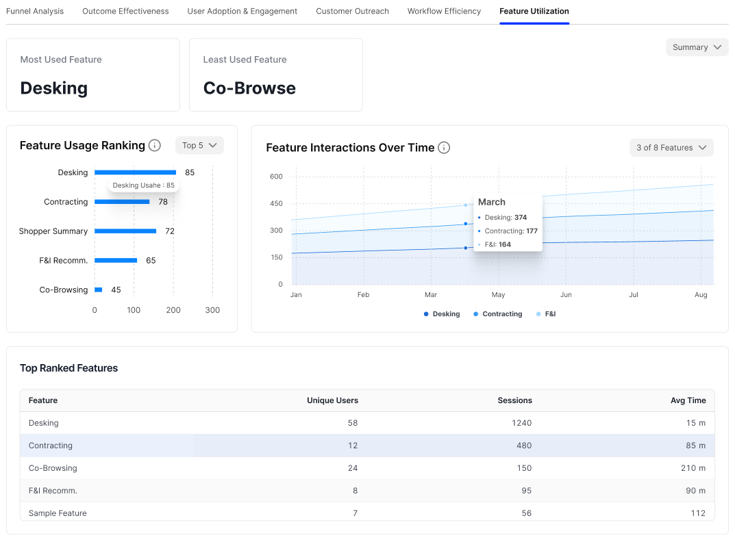
Most Used Feature
Displays the feature with the highest level of usage within the selected reporting period.
The KPI identifies the feature receiving the greatest amount of user interaction, providing a quick indication of the most adopted functionality in the Dealer Portal.
Least Used Feature
Displays the feature with the lowest level of usage within the selected reporting period.
This KPI helps identify features with lower adoption and provides visibility into functionality that may require further investigation or user engagement.
Feature Usage Ranking
Displays a ranked list of features based on their usage.
Users can use the Top 5 filter to control the number of features displayed.
The horizontal bar chart compares feature usage across available features, such as:
- Desking
- Contracting
- Shopper Summary
- F&I Recommendations
- Co-Browsing
The bars represent the relative usage of each feature, making it easy to identify the most frequently used functionality.
Feature Interactions Over Time
Displays how feature interactions change over the selected reporting period.
Users can use the feature selector to choose which features are displayed on the chart.
The visualization includes:
- Time-based trend - Shows feature interactions across the reporting period.
- Feature-specific lines - Each selected feature is represented separately.
- Interaction Volume - The vertical axis represents the number of interactions.
- Data Point Details - Hovering over a point provides the interaction count for the selected feature and period.
This visualization helps users identify changes in feature adoption and interaction patterns over time.
Top Ranked Features
Provides a tabular view of feature performance and usage.
The table includes:
- Feature - Identifies the Dealer Portal feature.
- Unique Users - Displays the number of distinct users who interacted with the feature.
- Sessions - Shows the number of sessions in which the feature was used.
- Avg Time - Displays the average amount of time users spend interacting with the feature.
This view provides additional context beyond simple usage volume by showing both the number of users and the time spent using each feature.
Feature Utilization Summary
Provides a detailed user-level breakdown of feature utilization.
The table includes:
- User - Identifies the dealer portal user.
- Role - Displays the user’s assigned role.
- Features - Lists the features used by the user.
- Total Session Duration - Shows the total amount of session time associated with the feature.
- Avg Time - Displays the average time spent using the feature.
- Sessions - Shows the number of sessions in which the feature was accessed.
The table supports expandable user rows, allowing users to view the individual features associated with each dealer portal user and examine their feature-level engagement.